
Anyway, in honor of my awesomely fashionable and new blog re-design*, I thought I'd dedicate this post to the fashion do's and don'ts that is college football uniforms (Yes, Nike...I'm talking mostly to you). I know there have been many articles done on this, but not by me. And that's what counts.
If your school is marked as a fashion don't, I'm sorry. Don't hate! Just get better uniforms, mmmkay?
Do keep it simple.
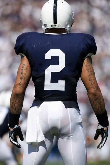
DON'T play around with weird, asymetrical color blocking.


Example: Virginia Tech and Florida. Orange in general isn't flattering on most people. But when you smear it down one arm, it makes your players look like they entered a fight with Chester Cheetah....and lost miserably.
DO go bold once in a while, though.

But yes, I could do without the gold shoes...it gets me all confused thinking there's a penalty flag on every down.
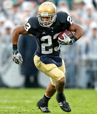
DON'T confuse your fans by throwing in a random color.


Example: Notre Dame. So ummm.....Your colors are blue and gold right? Then what's up with the green jersey? To me, it makes more sense for you to be green (hello, Fighting Irish), but I'm not here to make that decision. I'm just here to tell you to pick a color and STICK WITH IT.
DON'T foray TOO far into the fashion world.
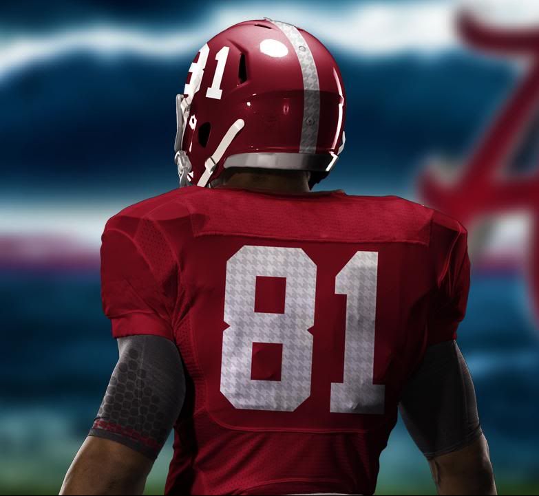
Example: Alabama. Look, I get that you (ie Nike) wanted to pay homage to the great Bear Bryant (who I assume wore a lot of houndstooth?). But a) it just makes your numbers look smudgy (and not in the good "rough and dirty way"). Plus, houndstooth on a football uni is just weird. Let's throw in a glen plaid and a polka dot while we're at it!
and finally,
DO take advantage of the fact that your big time alum happens to own a major athletic apparel company.
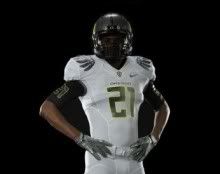
Example: Oregon. These kids must have lockers the size of Paris Hilton's closet. A uniform combo for every day of the week, plus one for special holidays! Love 'em or hate 'em, the Ducks definitely benefit from connections in high places. And let's be real...feathers are awesome!
So fellow football fashionistas....let me know what you think about my critique. Do you want to defend your team's hideous choices? Did I miss anyone (either good or bad)? Holla at me!
Images were provided by (top to bottom): Penn Live, fansonly.com, Bleacher Report, Bleacher Report, hondajvx.files.wordpress.com, Bleacher Report, nikeblog.com, and sportsgrid.com.
*********************************************************************************
Much love, thanks and appreciation to Diana at Custom Blog Designs for creating my fabulous new re-design. So easy to work with, great prices, and quick like a bunny! I definitely recommend to anyone looking for an update!


3 comments:
Thanks so much for the shout out!!! Not sure if our team's uniforms are OK or not, but my son just got into the marching band...so it's orange & blue for the entire family now!
Of course VT was on your Don't list. Surprise, surprise. ;)
I bleed orange and maroon, and I'm damn proud of it. Even if it is a weird/ugly color combo.
Only intolerable when it's just covering one arm.
Post a Comment